
Citibank's mobile banking direction for China
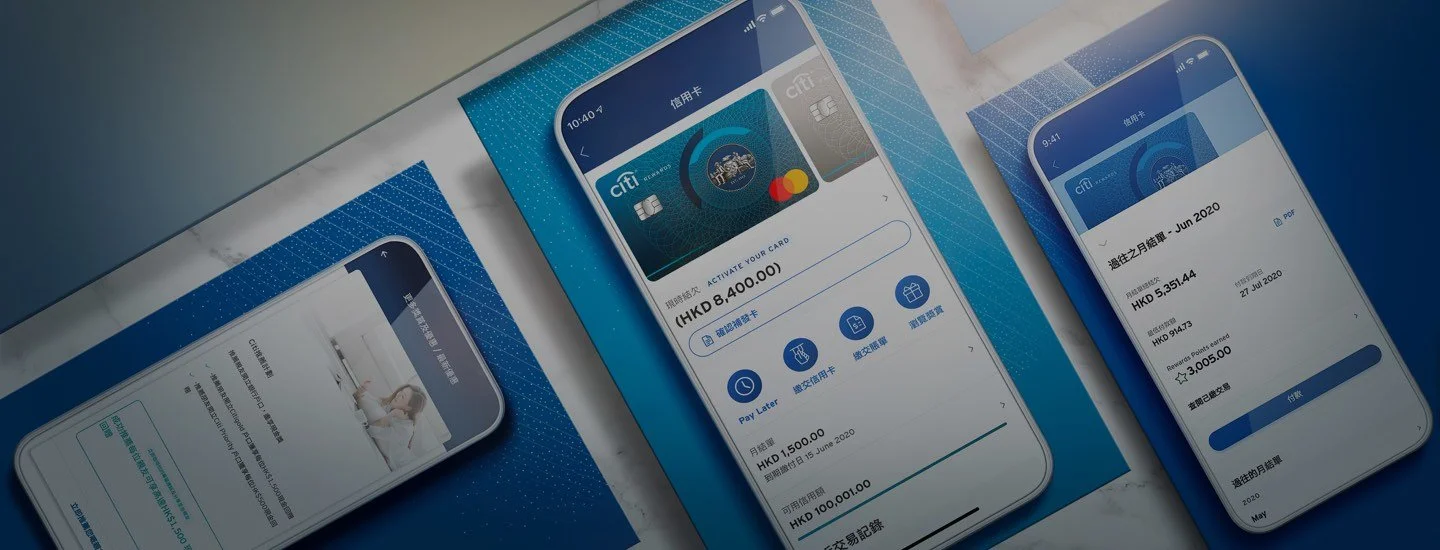
My role
• Role: Project lead / Duration: 4.5 months (2018)
• I set the design direction, worked on the research and design with the team, reviewed every deliverable and presented the work to Citibank.
Key insight: In China, a banking app is judged on security, clarity and convenience. Security and clarity are now the minimum every bank meets; convenience is where a bank can still stand out.
Project background
Citibank has been in China for over 10 years and is still one of the leading foreign banks, offering overseas financial benefits and global expertise. That is no longer enough: local banks offer competitive products and services and, above all, mobile convenience. Our goal was to find and fix the most urgent customer needs specific to China's digital environment, and help Citibank reconnect with its customers.
We focused on three areas:
Pain points and needs: we knew the current digital products fell short. Which problems mattered most, and which fixes would bring quick improvement?
Value proposition: Citibank's credit card benefits and financial products are competitive. How could it explain their value to current and future customers in a way that sticks?
Customer engagement: how could Citibank build closer relationships and more loyal customers?
Approach
Three phases: research, synthesis and design.
Market and competitors: the key challenges for Citibank's main business units in China (credit cards and finance), with advice on digital channel priorities and key functions.
Interviews and journeys: with both Citibank customers and front-line staff.
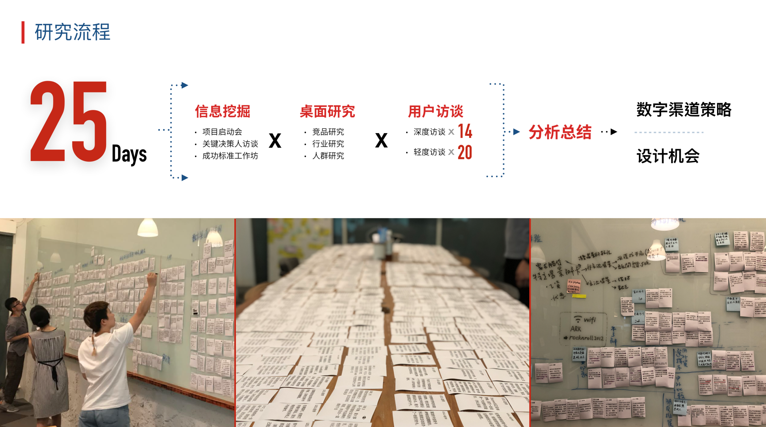
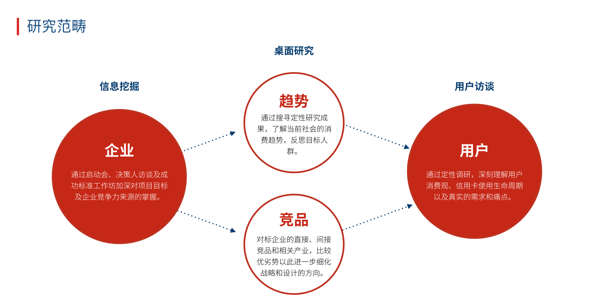
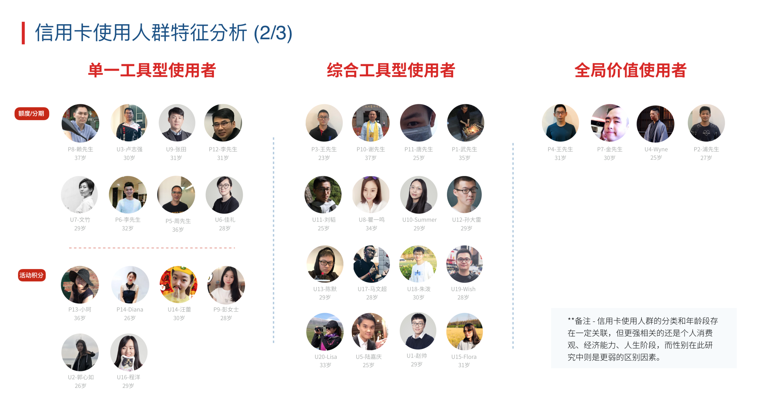
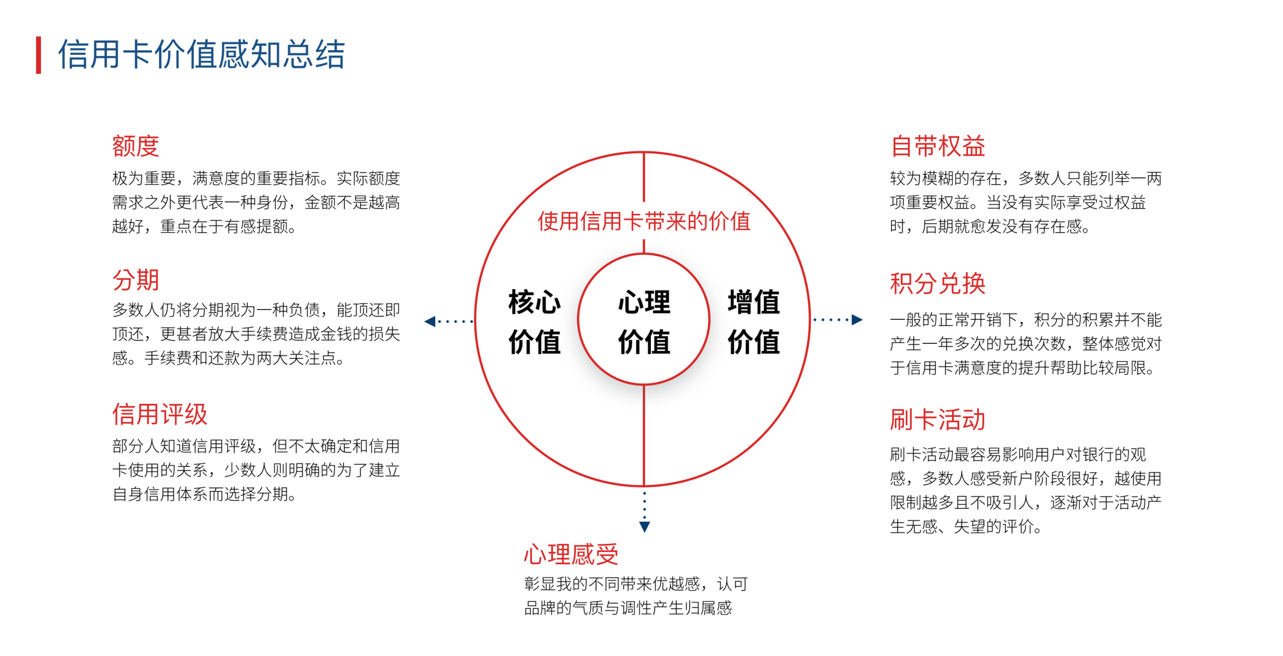
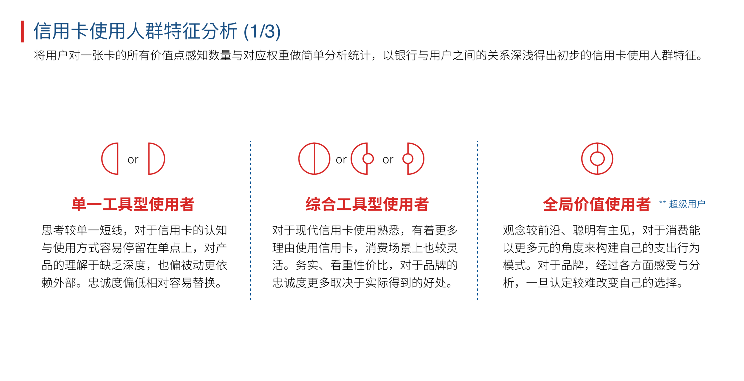
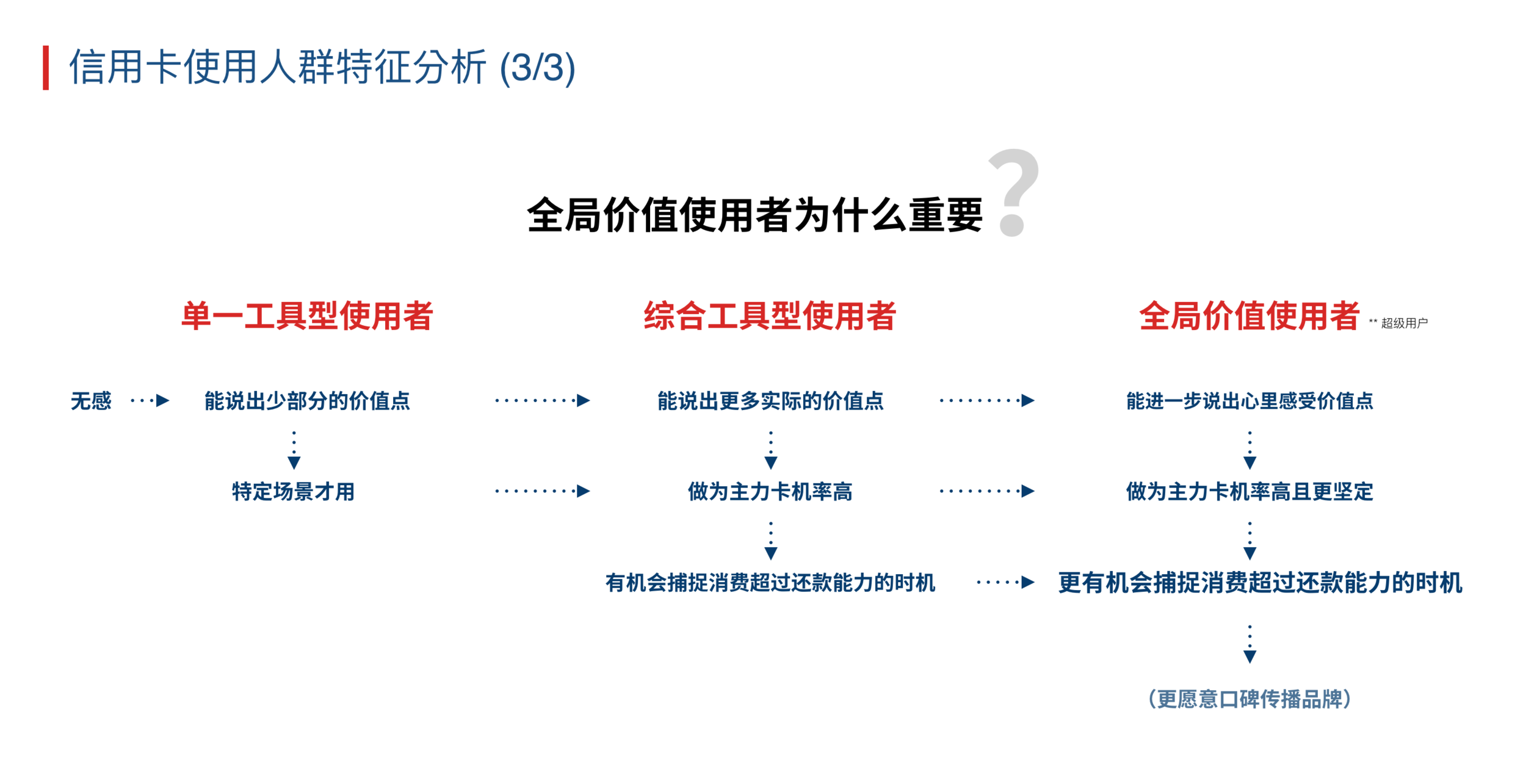
Synthesis: explained Chinese customers' needs, design preferences and expectations to Citibank's global team, to reshape Citibank China's digital experience.
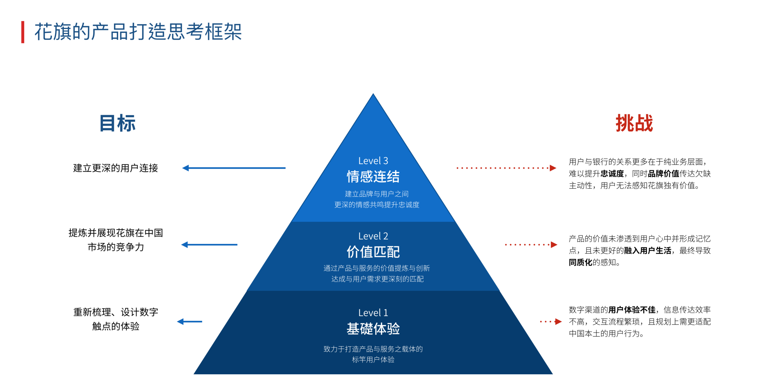
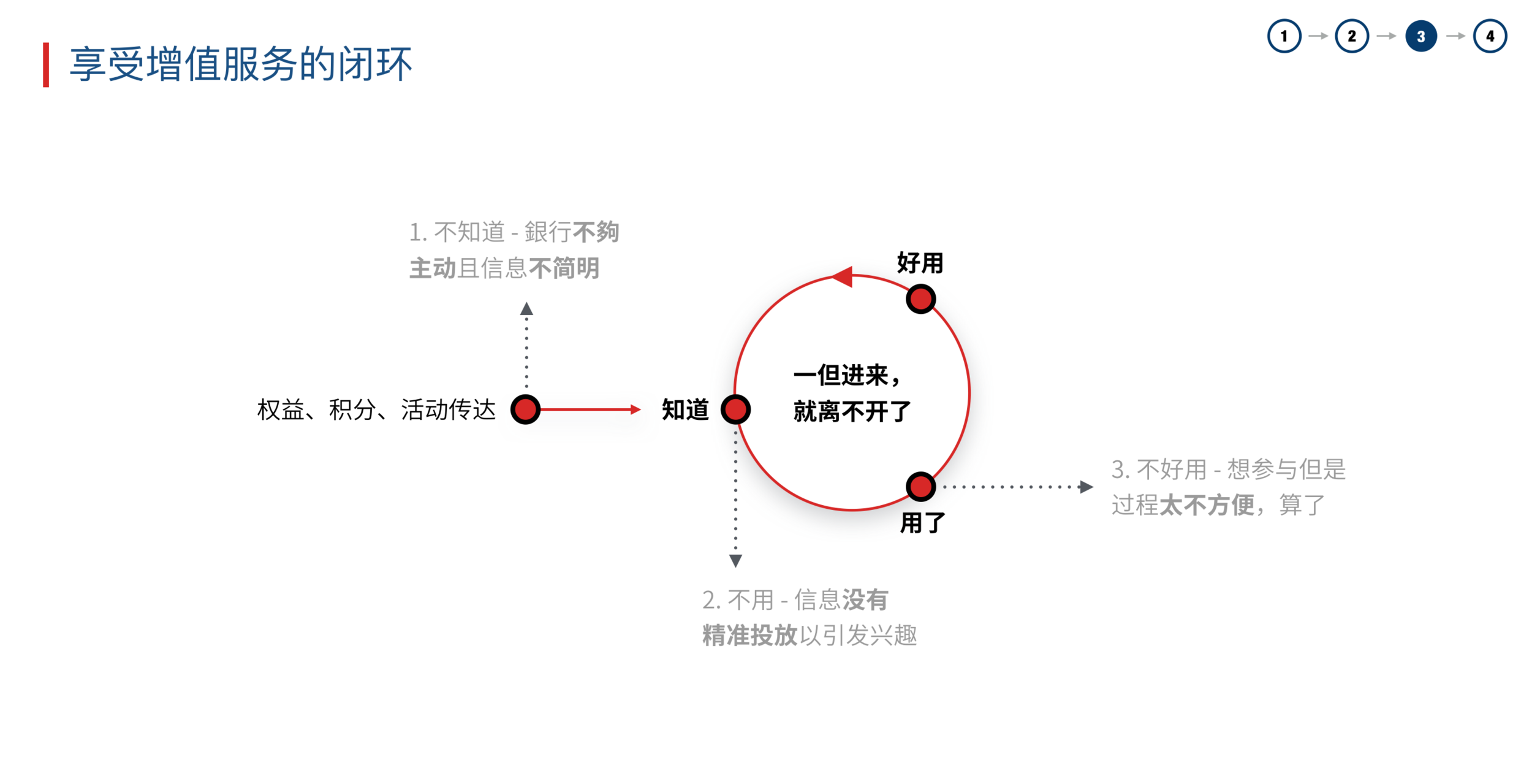
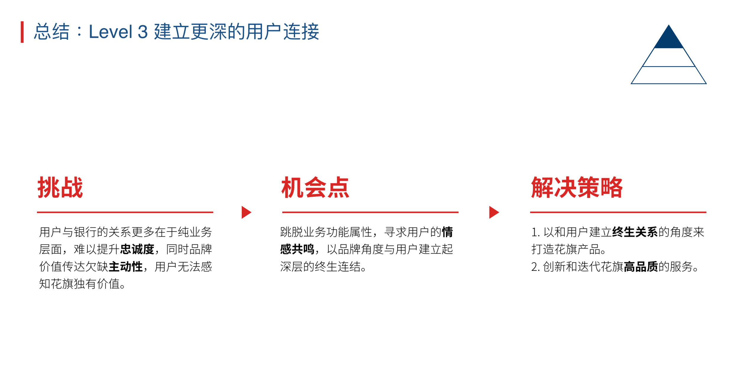
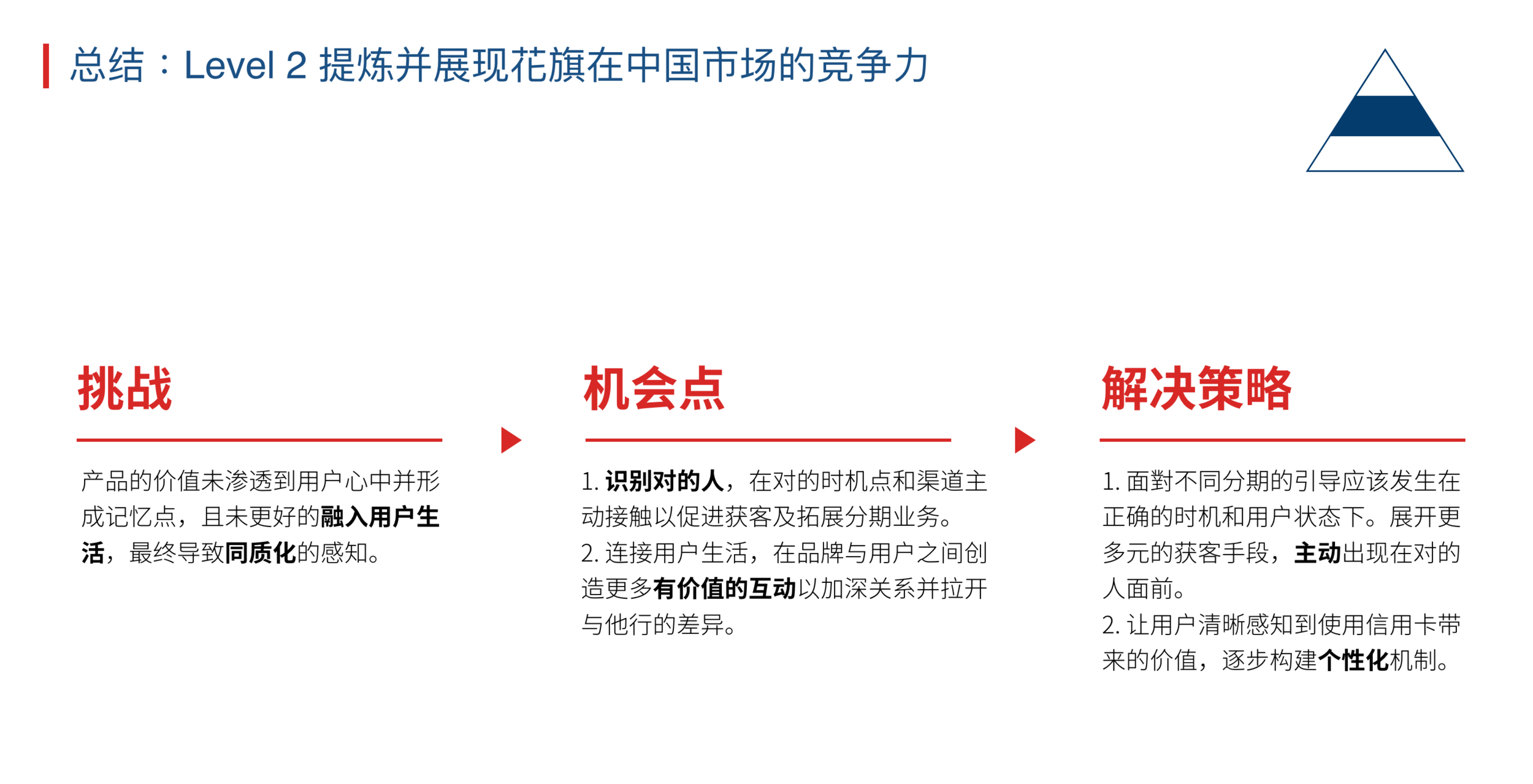
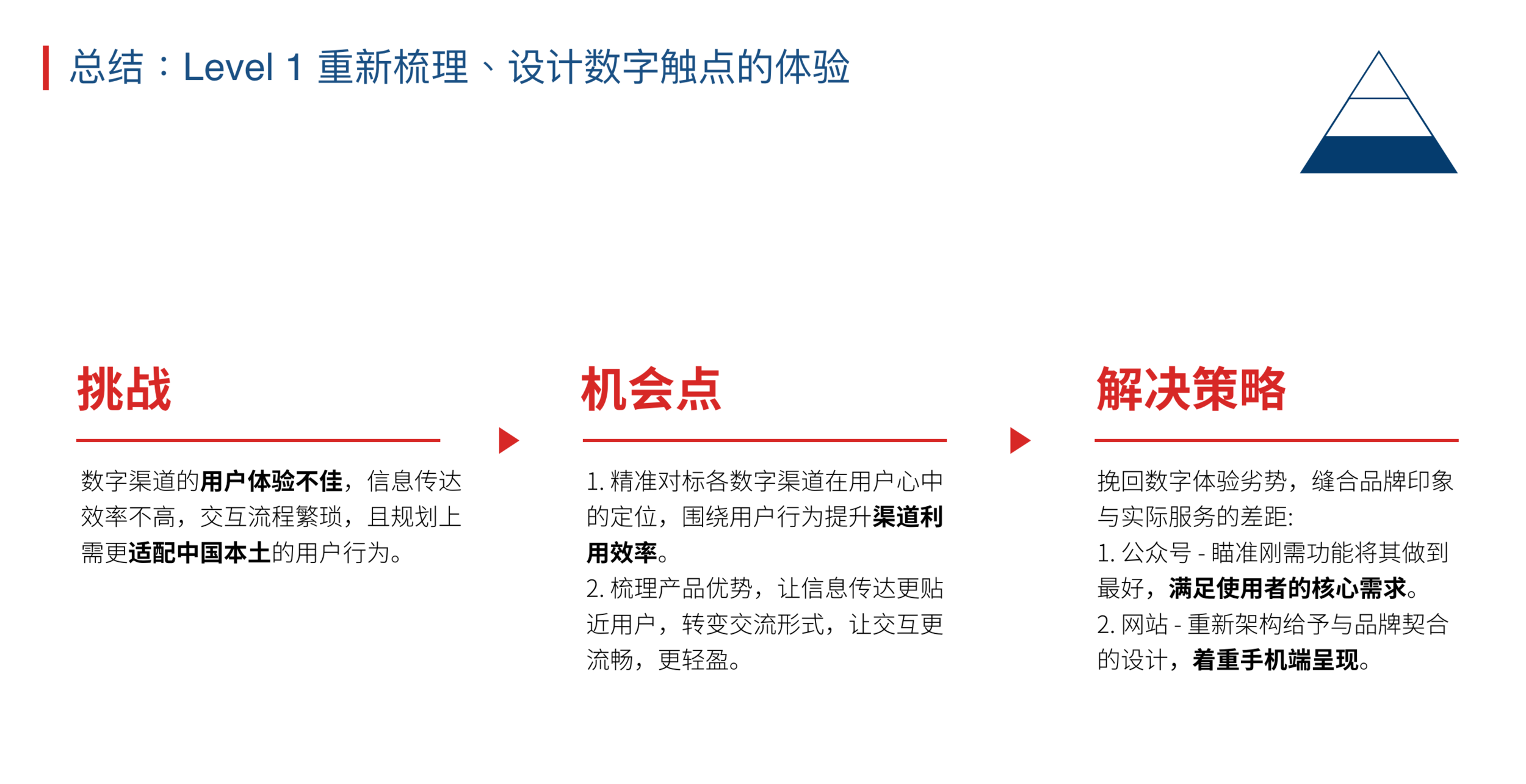
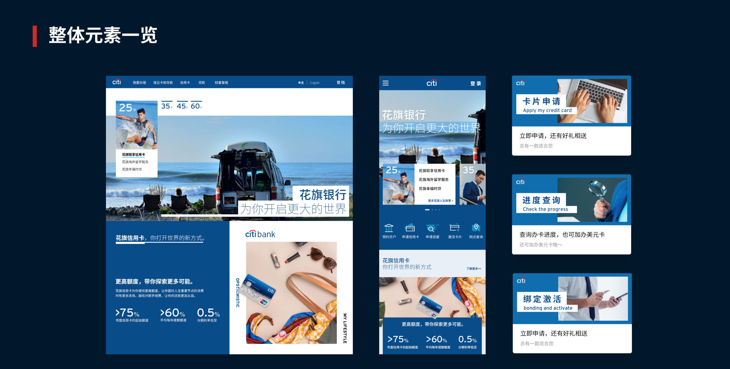
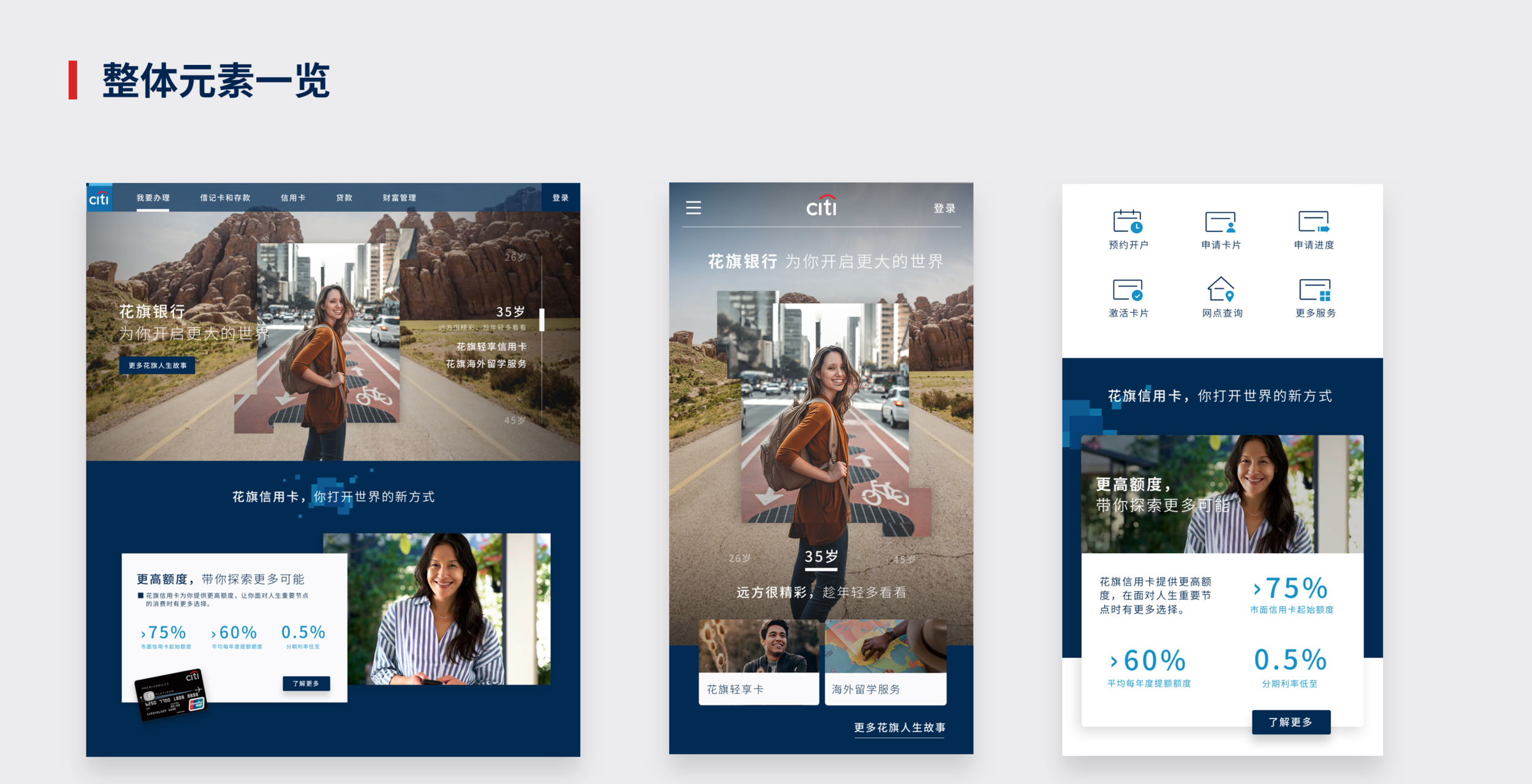
Design: visual concepts based on the research.
Takeaways
What matters most in a banking app in China?
Three things: security, clarity and convenience.
Security works on two levels: real and perceived. Real security is technical, but it shows up in the interaction: how long does an action take, are there unnecessary checks, do people have to remember too much? Perceived security comes from a smooth journey and clear visual and written cues: people should always know what is happening and whether an action worked.
Clarity matters because a bank app holds a huge amount of information. The aim is to keep people oriented so they never hesitate: know the core services and place their entry points accordingly, connect related services along the customer journey, and explain important numbers right where they appear.
In China, security and clarity are now the minimum. Most banking apps look alike because layouts and features have standardised, leaving little room for new interaction or visual ideas. In finance, people need efficiency, and familiarity provides it.
For a designer, convenience is the most interesting of the three. It means being proactive without being intrusive, and it takes real thought. Are services available on mobile whenever people need them, and can some work partly offline? Is the experience consistent across platforms, so people don't have to choose? Can an online service speed up a branch visit, or replace it? This is where every bank is trying to stand out, so decision-makers need a clear design direction and clear priorities for where to invest.
Work done @ ARK Innovation Consulting / 2018