NXT Platform - Designing in Code with AI
Pre-AI vs post-AI
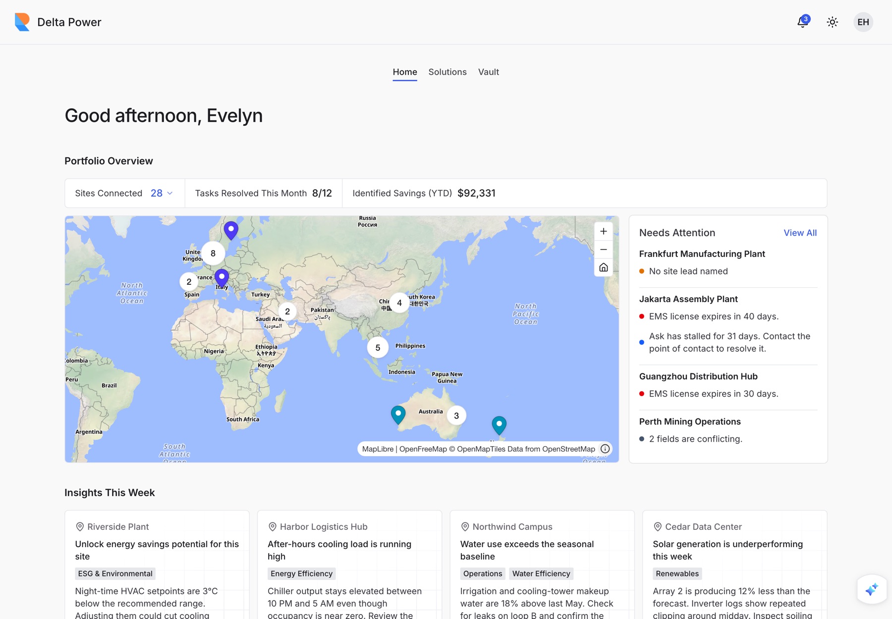
My earlier Akila work was done entirely in Figma. NXT is the same kind of product, built a different way: as a working prototype, with AI coding tools as a collaborator.
| Pre-AI: Akila web platform | Post-AI: NXT platform | |
|---|---|---|
| Medium | Figma files | A deployed React prototype |
| Design system | Figma styles, components and UX/UI guidelines | The same ideas as running code: tokens, components, and a 14-page documentation site |
| Handoff | Annotation templates and specs for developers | Written rules (tokens, UI conventions, a copy guide) that both people and AI tools follow |
| Mobile | Adaptive layouts in Figma | Real touch behaviour, shipped as an iOS app |
The problem
Operations teams look after dozens of sites. Certifications, documents and open issues sit in different places. They need three answers fast: what needs my attention, which tool fixes it, and where is the document. It also has to work at a desk and on a phone in a plant room.
The solution
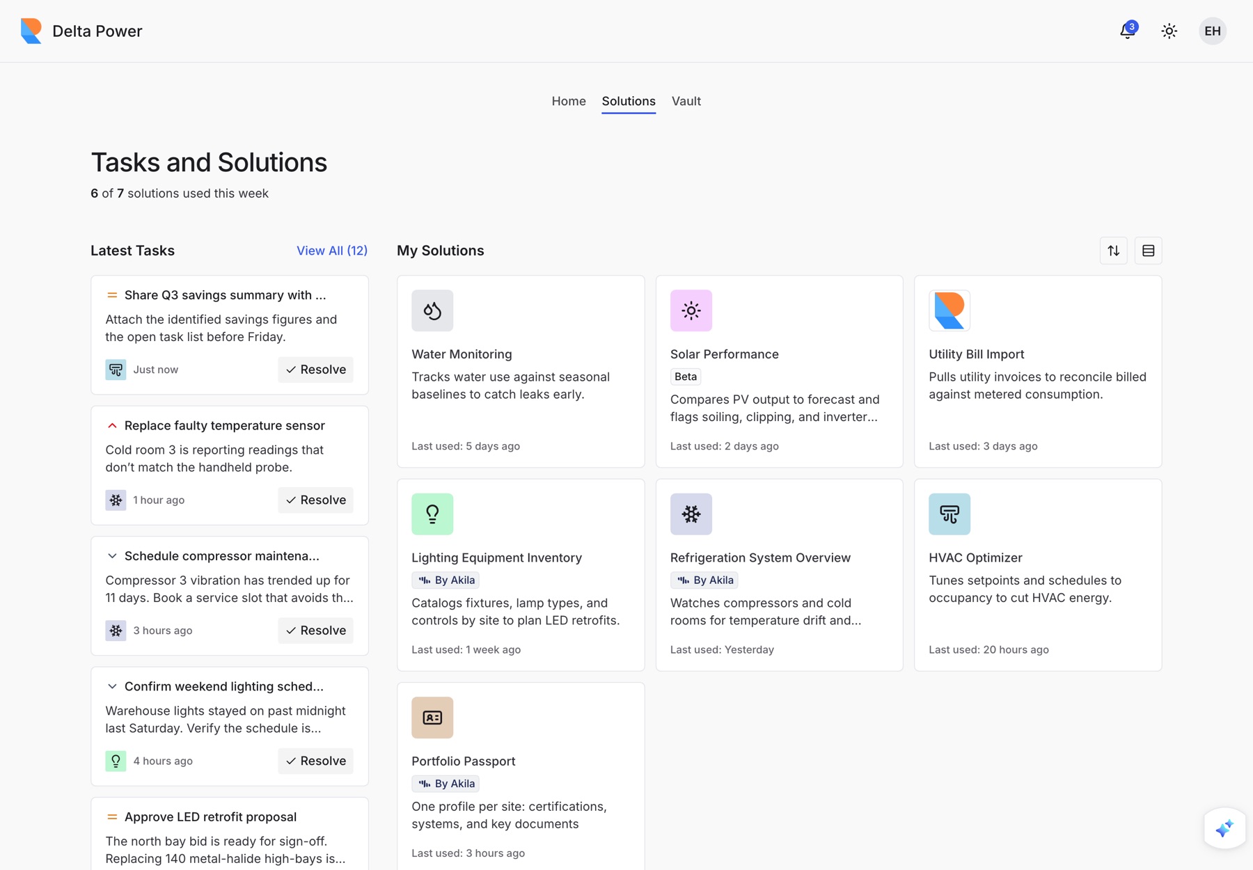
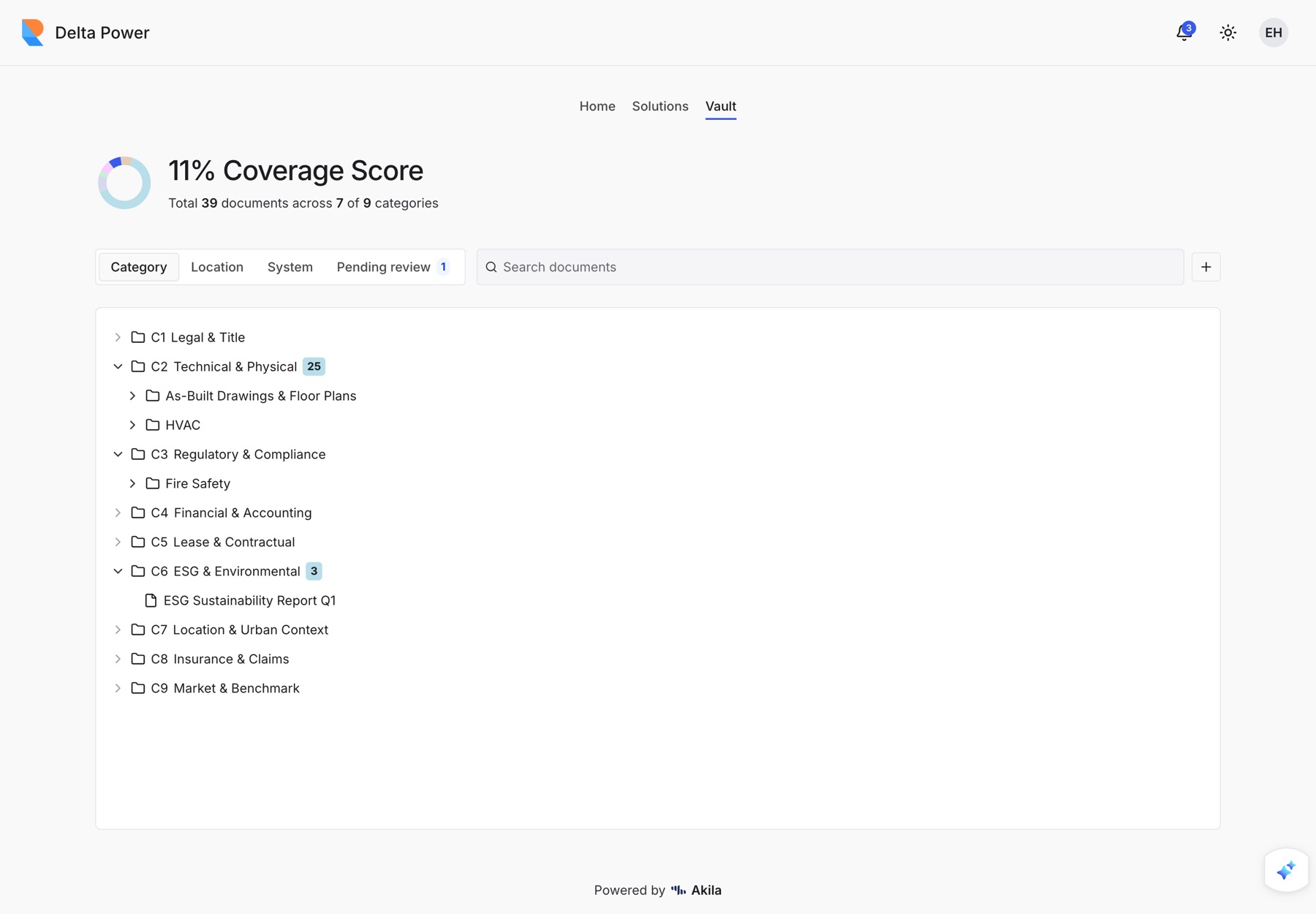
Three tabs, one job each.
| Answers | Key decision | |
|---|---|---|
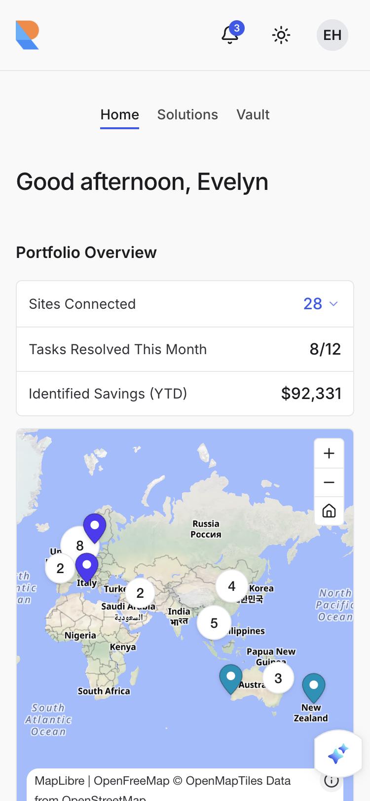
| Home | What's happening? | Leads with exceptions: a severity-ranked Needs Attention list beside a clustered portfolio map |
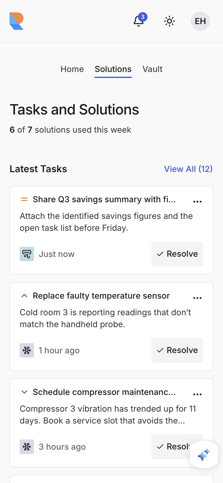
| Solutions | What can I do? | A launcher that adapts: sort, compact view, drag to reorder, verified badges |
| Vault | Where's the record? | Browse documents by category, location or system, with a coverage score |
The design system
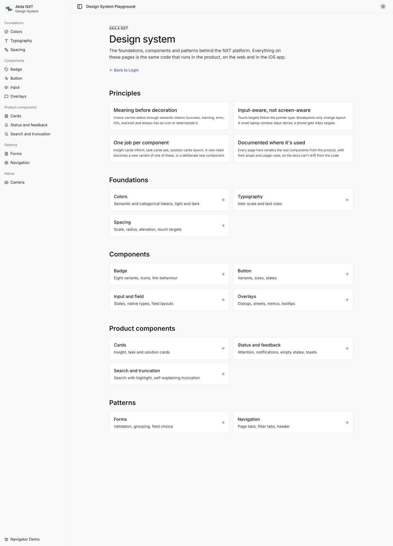
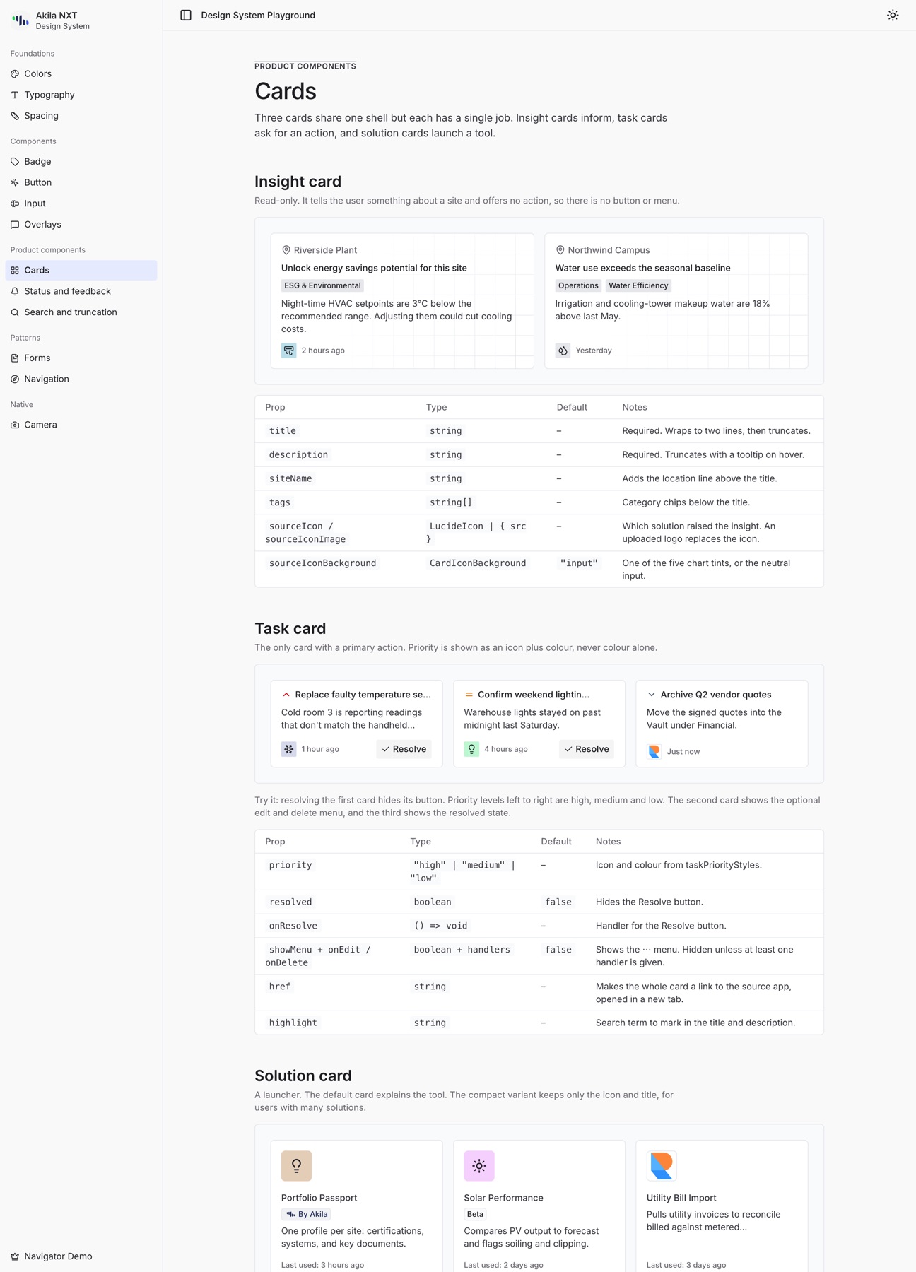
I built the system alongside the product, so every screen comes from the same rules. It lives in a documentation site of 14 pages that render the real product components, with props tables and do/don't guidance.
- Tokens: semantic colours (success, warning, error, info, inactive) with light and dark themes. Colour never carries meaning alone.
- Product components: Insight, Task and Solution cards, each with one job. Insight informs, Task asks, Solution launches.
- Written conventions: a UI rules file and a UI copy guide keep design and AI-assisted code consistent.
Touch-first, then native
- Hit targets follow the input device (
pointer: coarse), not screen width. A small laptop window stays dense, and a phone gets 44px targets. - Shipped as an iOS app (Capacitor): safe areas, no input auto-zoom, camera capture.
- A feature-flag file sets which pages each customer's build includes.
How I worked with AI
- I decided the structure, tokens, interaction rules and copy voice.
- AI wrote code against those rules. I reviewed it and ran consistency and performance audits at three points.
- I checked the documentation against the source. When I audited the docs, four statements were wrong (a shadow level, a clamp length, an unread style, a card border) and I fixed them.
What I took away
- Design intent becomes enforceable when it is written as rules and tokens.
- A working prototype exposes touch, map and responsive problems that static mockups hide.
- The designer's job shifts toward specifying clearly and reviewing carefully.